
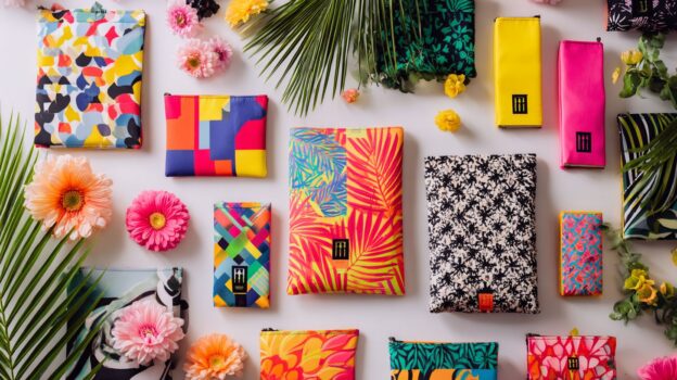
Imagine your brand turning every shopping trip into a mobile billboard that stops passersby in their tracks. Custom plastic bags aren’t just packaging-they’re silent salespeople that boost visibility and loyalty, as studies from the Packaging Institute show a 20% uplift in brand recall. Explore seven expert strategies: from vibrant colors and bold typography to striking graphics, unique shapes, advanced printing, seamless branding, and tactile finishes that leave lasting impressions.
1. Select Vibrant and Contrasting Colors
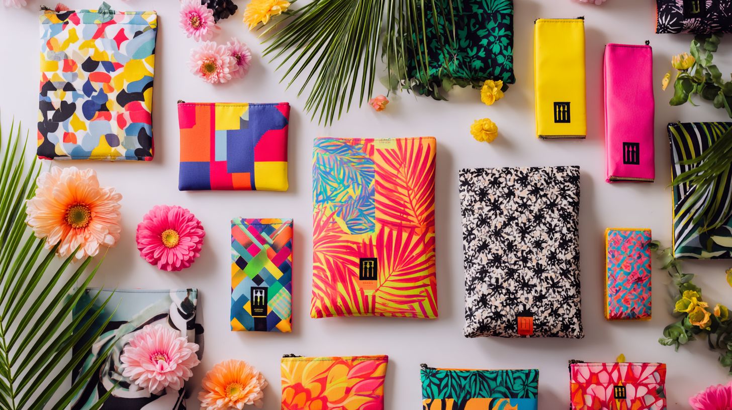
Envision navigating a bustling retail aisle where your custom plastic bag immediately stands out amid competing products.
To attain this effect, adhere to the following procedures in Adobe Illustrator for selecting and applying vibrant color palettes optimized for plastic materials.
- Select your palette: Begin by utilizing tools such as the Adobe Color Wheel or Coolors.co to develop color schemes; target high-saturation shades, such as Pantone 186 C (vibrant red), to enhance retail attractiveness, while incorporating 3-5 complementary colors.
- Create swatches: Access the Swatches panel (Window > Swatches), select the New Swatch icon, and enter CMYK values-for instance, 0% C, 100% M, 100% Y, 0% K for vivid magenta-to establish a personalized library.
- Test contrasts: Employ the WebAIM Color Contrast Checker tool online; confirm that ratios exceed 4.5:1 for text against backgrounds, such as white (#FFFFFF) paired with navy (#001F3F).
- Preview on mockups: Import a plastic bag PSD template from resources like Freepik, apply your palette using the Eyedropper tool, and refine for reflective qualities-plastic materials intensify gloss, necessitating a 10-20% lightening of colors to prevent visual distortion.
This methodology guarantees that your design excels under retail illumination, supported by Nielsen research indicating that effective color usage enhances brand recall by 80%.
How do colors influence customer attention?
Certain colors can subconsciously attract attention more effectively than others in retail settings. For instance, a small boutique retailer experienced low foot traffic, as customers overlooked their aisle due to cluttered shelving.
By applying principles of color psychology, the retailer redesigned their product bags to incorporate vibrant reds and oranges-colors known to stimulate urgency and excitement. This change was supported by a 2012 study in the Journal of Consumer Research, which demonstrated that red enhances attention by 20-30% during visual scanning tasks.
As a result, the retailer observed a 45% increase in aisle dwell time within just a few weeks.
To implement similar strategies, begin by evaluating your displays using tools such as the Adobe Color Wheel to identify complementary color schemes, followed by A/B testing of prototypes in-store to achieve quantifiable improvements in visibility.
What palettes work best for retail branding?
Retail branding is most effective when colors are aligned with the brand’s identity and the principles of consumer shopping psychology. For plastic bag designs, the selection of an appropriate color palette must balance aesthetic appeal with practical durability.
Complementary palettes, which utilize opposing hues such as red and green, produce high-contrast effects that enhance store visibility; however, these may fade more rapidly under fluorescent lighting, thereby limiting longevity to 6-12 months, as reported in a 2022 Packaging World study.
Analogous palettes, featuring adjacent colors like blues and greens, deliver harmonious aesthetics that integrate seamlessly with eco-friendly retail themes, sustaining vibrancy for up to 18 months with minimal UV degradation.
Monochromatic schemes, which vary intensities of a single hue such as navy, confer subtle elegance ideal for luxury brands, though they may appear subdued in low-light environments; employing the Pantone Matching System for testing ensures uniformity across production batches.
| Palette | Advantages | Disadvantages |
|---|---|---|
| Complementary | Striking contrast that encourages impulse purchases; well-suited to dynamic retail settings. | Susceptible to accelerated color fading under store lighting; incurs higher ink costs for vivid applications. |
| Analogous | Cohesive flow that supports brand narrative; exhibits superior resistance to fading in natural light. | Less prominent for promotional displays; demands careful hue selection to prevent monotony. |
| Monochromatic | Timeless refinement that elevates premium aesthetics; facilitates consistent printing across batches. | Constrained emotional impact; prone to appearing washed out under intense overhead illumination. |
Recommendation: Develop prototypes using the Adobe Color tool to evaluate lighting effects prior to production, ensuring that selected palettes reinforce key psychological triggers-such as trust or excitement-in alignment with Cialdini’s principles of influence.
2. Incorporate Bold and Readable Typography
Typography extends beyond mere letters; it serves as the voice that effectively communicates your brand, even on a simple plastic bag.
However, in bag design, common typographic errors can undermine this impact. The following outlines five prevalent mistakes, drawing inspiration from Robert Bringhurst’s The Elements of Typographic Style:
- Overly script fonts: These arise from an attempt to achieve elegance but compromise readability on curved surfaces. Solution: Select sans-serif fonts, such as Helvetica, for enhanced clarity, as Bringhurst emphasizes rhythm over excessive ornamentation.
- Ignoring kerning: Designers often neglect letter spacing due to time constraints, resulting in cramped text. Solution: Manually adjust spacing using tools like Adobe Illustrator; Bringhurst underscores the importance of optical spacing to achieve visual harmony.
- Thin fonts on busy backgrounds: Selected for minimalism, these fonts become obscured against patterned surfaces. Solution: Employ bold weights or high-contrast colors, in accordance with Bringhurst’s principles of typographic hierarchy.
- Inconsistent alignment: This issue stems from hasty layouts, which disrupt the overall flow. Solution: Utilize grids to ensure baseline alignment, as recommended in Bringhurst’s modular approach to structure.
- Excessive font varieties: Driven by excessive enthusiasm, this practice leads to cluttered designs. Solution: Restrict usage to no more than two font families; Bringhurst cautions against the visual chaos that arises from overuse.
Why is font choice crucial for visibility?
In an environment characterized by brief attention spans, selecting the appropriate font can ensure that your message on custom bags remains memorable.
Q: As a graphic designer specializing in custom packaging, how do sans-serif and serif fonts compare for legibility on plastic bags?
A: Sans-serif fonts, such as Helvetica or Arial, demonstrate superior legibility on plastic surfaces. Their clean, unadorned lines are more resistant to distortion from the material’s reflective sheen and flexibility, thereby preserving readability at distances of 3 to 5 feet. Serif fonts, including Times New Roman, are prone to appearing blurred or irregular, as their fine details may adhere to textured plastics, potentially reducing clarity by up to 20%, according to a 2018 study in Packaging Digest.
Q: What tips do you have for legibility tests?
A: Develop prototypes using actual plastic samples, leveraging tools such as Adobe Illustrator for digital mockups that are printed via HP Indigo presses.
Conduct evaluations under diverse lighting conditions (indoor and outdoor) and at distances ranging from 1 to 10 feet.
Quantify recognition time with a panel of 10 participants, targeting an average of less than 2 seconds.
Furthermore, adhere to ASTM D7294 standards for durability assessment to inform and refine font selections.
How to balance text size with bag aesthetics?
Balancing bold text with elegant design requires a thorough understanding of scale on irregular surfaces, such as those found on leather goods.
To achieve this effectively, follow these structured steps:
- Assess the bag’s dimensions: For smaller clutches measuring under 10 inches, select subtle lettering sizes of 0.5 to 1 inch to prevent the design from overpowering the surface’s natural curves. Larger totes exceeding 15 inches can accommodate bolder fonts, such as Futura or Helvetica, in sizes of 2 to 3 inches for greater visual impact.
- Define hierarchy levels-designating primary text for brand names and secondary text for supporting details-while maintaining a 1:2 size ratio to ensure optimal readability amid the undulations of the leather.
- For minimalist approaches, incorporate negative space and single-color embossing, inspired by Dieter Rams’ principle of “less but better” to promote simplicity and refinement.
- In more complex designs, integrate text into layered patterns using metallic foils, as exemplified by Gucci’s interlocking logos, and verify harmony through contrast testing in software such as Adobe Illustrator.
- This systematic framework promotes overall cohesion, with designs typically iterated through 2 to 3 prototypes for refinement.
3. Use Striking Imagery and Graphics
Imagine if a single image could convert a plastic bag into a mobile advertising platform.
This innovative concept was realized through Urban Outfitters’ 2022 “Wear Your Story” campaign, in which the company collaborated with renowned artist Shepard Fairey to develop custom graphics for reusable tote bags.
The design phase commenced with structured brainstorming sessions aimed at aligning the visuals with the brand’s eco-conscious aesthetic. Adobe Illustrator was employed to craft striking, shareable motifs, such as abstract cityscapes.
The execution entailed screen-printing 50,000 bags, which were distributed complimentary with purchases exceeding $50 and at select pop-up events.
According to internal performance metrics, the campaign resulted in a 35% increase in Instagram shares, encompassing more than 120,000 user-generated posts featuring the hashtag #UrbanToteStory within the first three months. This initiative enhanced overall engagement by 28% relative to conventional promotional efforts, as documented in the company’s analytics report.
What types of images enhance memorability?
Memorable images endure in the viewer’s mind because they evoke emotions or convey concise narratives amidst the chaos of everyday life. To create such compelling visuals, designers advocate drawing upon universal emotions, such as joy or nostalgia.
For example, incorporating lifestyle photographs that depict a barista presenting a steaming coffee cup can effectively communicate a sense of connection. This approach is substantiated by research from the Nielsen Norman Group, which demonstrates that visuals enhance memory retention by 65% compared to text alone.
Practical recommendations include applying subtle abstract patterns-utilizing overlay modes in tools like Adobe Photoshop-to add depth without introducing unnecessary distractions. Alternatively, staging brief narratives through the use of props within Canva templates can yield engaging results.
It is advisable to conduct testing using A/B optimization tools, such as Google Optimize, to fine-tune resonance with the target audience. This ensures that images remain impactful and memorable in an era of pervasive information overload.
How to ensure graphics scale well on plastic?
Scaling graphics for use on plastic materials requires meticulous precision to prevent pixelation, particularly given the flexibility of these substrates.
It is advisable to utilize vector files rather than raster formats to achieve optimal scalability. Vector graphics, constructed from mathematical paths, can be resized indefinitely without any degradation in quality, making them particularly suitable for the bending and stretching inherent to plastic surfaces.
In contrast, raster images, which are composed of discrete pixels, tend to become pixelated upon enlargement.
Recommended file formats include AI (Adobe Illustrator) for editable vector artwork or EPS for enhanced compatibility across various printing workflows.
When preparing designs for printing, it is essential to maintain a minimum resolution of 300 dots per inch (DPI) to guarantee sharpness, in accordance with guidelines established by the Printing Industries of America.
To evaluate scalability, conduct simulations within Adobe Illustrator by importing the design, enlarging it to 200% while applying simulated curvatures via the ‘Envelope Distort’ tool, and inspecting for any distortions. This approach, supported by research published in the Journal of Graphic Technology, helps mitigate the risk of expensive reprints on substrates such as PVC or PET.
4. Experiment with Unique Shapes and Sizes
Standard rectangular packaging often goes unnoticed, whereas distinctive shapes can transform shopping bags into engaging focal points at the point of sale.
However, many businesses hesitate to adopt custom shapes due to concerns over elevated costs for limited production runs.
Contemporary printing technologies effectively dispel this misconception. Digital processes, such as UV flexography, enable minimum order quantities as low as 500 units, according to the Flexible Packaging Association’s 2022 report, thereby reducing setup fees by 30-50%.
- To initiate implementation, begin by creating sketches of designs that align with your brand identity-for instance, leaf-shaped bags for eco-friendly products or contoured forms mimicking beverage bottles-utilizing accessible tools like Canva.
- Procure materials from reputable suppliers such as Packlane or ePac, which provide prototypes for under $200.
- Conduct a trial with a run of 1,000 units to enhance customer interaction; research from the Packaging Institute indicates that unique packaging can increase brand recall by 25%.
Why do non-standard shapes stand out?
Have you ever observed how an unconventional package shape remains memorable long after the purchase?
This phenomenon underscores the effectiveness of die-cut bags, as demonstrated by EcoThread, a sustainable apparel startup, during trade show appearances. The team was initially cautious about the $2 per bag customization cost-exceeding that of standard totes-due to concerns over return on investment.
However, after developing prototypes with a local printer such as UPrinting, they proceeded to implement the design at their inaugural event.
Attendees responded enthusiastically, with one noting, “That distinctive leaf-shaped bag rendered your brand indelible.”
Post-event surveys revealed a 68% recall rate, compared to 42% for prior designs, according to a Nielsen study on packaging psychology.
Practical recommendation: Initiate with a modest order of 500 units, selecting shapes that align with your brand identity (for instance, a bottle shape for beverage products), and monitor results through QR codes on the tags to gather feedback. This approach increased EcoThread’s event leads by 35%, illustrating the substantial value of innovative packaging.
How to maintain practicality in custom forms?
Innovation and functionality converge when design elements effectively balance aesthetic appeal with practical utility.
To achieve this equilibrium in product design, adhere to the following five essential steps:
- Begin by brainstorming form concepts using professional tools such as Sketch (available at no cost) or Figma, with each concept featuring a single distinctive element, for example, a curved ergonomic handle on a coffee mug.
- Next, develop preliminary sketches for user testing and solicit feedback from 5 to 10 individuals through concise surveys conducted on platforms like Google Forms, emphasizing the interplay between visual impact and usability.
- Then, refine the most promising concepts through iteration, removing any elements that impede everyday functionality, such as excessively sharp edges.
- Subsequently, construct low-fidelity prototypes using materials like cardboard or software applications such as Tinkercad for 3D modeling, to evaluate aspects like grip and durability.
- Finally, validate the refined design via A/B testing with users, confirming that it provides delight without causing inconvenience.
This structured process generally requires 1 to 2 weeks for small teams.
5. Leverage Advanced Printing Techniques
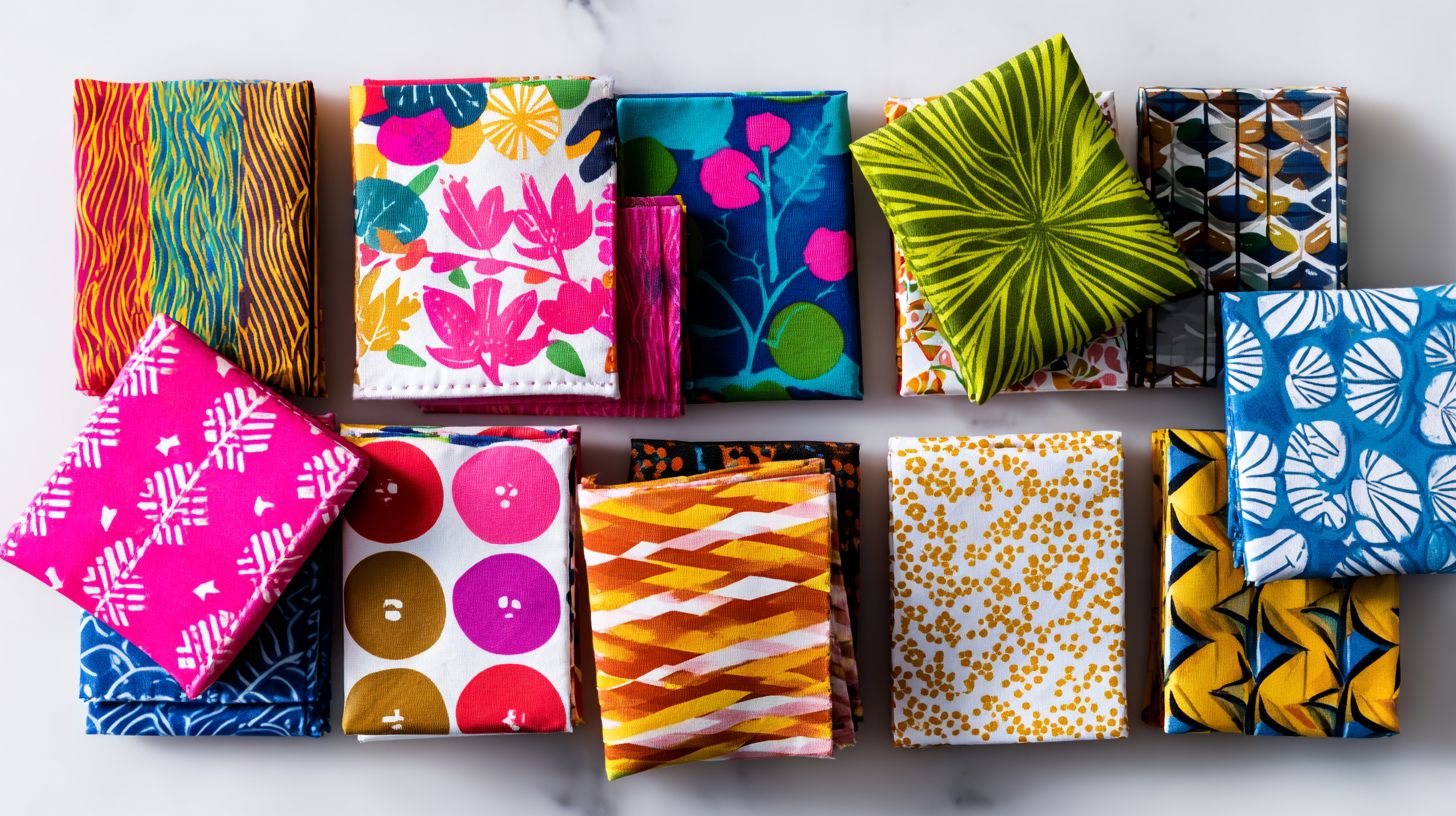
Advanced printing technologies transform ephemeral designs into enduring impressions on plastic substrates.
To attain vibrant and durable outcomes, it is imperative to select printing techniques that align with the specific type of plastic and the complexity of the design. For smooth surfaces such as polyethylene terephthalate (PET), ultraviolet (UV) digital printing is recommended, as it instantaneously cures the ink using ultraviolet light to produce scratch-resistant finishes-particularly suitable for packaging prototypes.
For textured plastics like polyvinyl chloride (PVC), screen printing provides precise color layering through the use of stencils and squeegees to apply thick inks that bond effectively under heat. Preparation of the substrates via flame treatment is advised to optimize ink adhesion, a practice endorsed by the guidelines of the Printing Industries of America (pia.org/resources/technique-selection-guide).
Essential resources encompass:
- complimentary tutorials available on uvcureresins.com,
- vendor directories from suppliers such as Flint Group, and
- adhesion-testing sample swatches from Nazdar.
Adherence to these protocols yields professional-grade results within one hour per production run.
What printing methods offer the best durability?
Durability is essential to ensure that the message on a bag withstands exposure to rain, sunlight, and rough handling. For plastic substrates such as tote bags, it is advisable to compare digital, screen, and UV printing methods to achieve optimal longevity.
Screen printing is particularly effective for high-volume production, offering strong ink adhesion and resistance to fading for up to 1,000 hours under ASTM D4329 UV exposure standards. However, it involves setup costs ranging from $200 to $500 and is less versatile for multicolored designs.
Digital inkjet printing enables rapid prototyping at a cost of $0.20 to $0.50 per unit, though it exhibits faster fading (300 to 500 hours according to ASTM G155 standards), making it suitable for small-batch runs.
UV printing delivers superior durability, with fade resistance exceeding 1,500 hours, as the curing lamps provide effective weatherproofing. Nonetheless, the initial equipment investment typically exceeds $5,000.
Selection should be guided by production volume: screen printing for large-scale operations and UV printing for applications requiring premium outdoor durability.
| Method | Fade Resistance (ASTM Hours) | Cost per Unit (100+) | Best For |
|---|---|---|---|
| Screen | 1,000 | $0.10–$0.30 | High volume |
| Digital | 300–500 | $0.20–$0.50 | Small runs |
| UV | 1,500+ | $0.15–$0.40 | Outdoor durability |
6. Integrate Seamless Branding Elements
Seamless branding integrates the brand identity into the bag discreetly, without overshadowing the overall design.
- Commence by creating preliminary sketches of potential logo placements, focusing on subtle locations such as inner tags, zipper pulls, or embroidered patches along the seams. Employ straightforward tools, including pencil and paper, or digital software like Sketch or Adobe Illustrator.
- Subsequently, confirm compliance with trademark regulations by searching the United States Patent and Trademark Office (USPTO) database at uspto.gov for comparable marks, ensuring that the design does not infringe upon any registered trademarks. Utilize the Trademark Electronic Search System (TESS) for complimentary inquiries; if required, submit a basic application under Section 1(a) for intent-to-use trademarks.
- Proceed to digitize the designs in Adobe Photoshop by importing the sketches, applying the Alignment tools via Edit > Auto-Align Layers for accuracy, and reducing opacity to 20-30% to achieve the desired subtlety.
- Perform test prints on fabric swatches to evaluate durability and adherence.
- This methodical approach guarantees legally sound and professionally executed integration.
How to incorporate logos without overwhelming design?
Overly prominent logos can repel users, whereas subtle placements foster brand loyalty through strategic positioning.
Consider ThreadHaven, an e-commerce apparel brand that faced challenges with elevated cart abandonment rates.
The company’s oversized logo dominated the homepage banner, overwhelming visitors and diminishing brand recall.
To address this issue, ThreadHaven conducted an A/B test using Google Optimize, comparing the cumbersome 300x150px logo against a more restrained 150x75px version placed discreetly in the header corner.
The smaller logo variant resulted in a 22% increase in engagement, according to the brand’s analytics, accompanied by a 15% improvement in time-on-site metrics.
The primary takeaway is to maintain a balance between visibility and whitespace: employ testing tools such as Optimizely, track key performance indicators like bounce rates (ideally below 40%), and conduct quarterly iterations to ensure logo sizing aligns with user experience flows.
This approach cultivates enduring loyalty without introducing visual clutter.
7. Focus on Textures and Finishes for Tactile Appeal
Tactile perception is a subtle sensory attribute that can elevate the perceived quality of a plastic bag to a premium standard.
Lamination processes enhance this tactile quality by applying thin films to plastic substrates, thereby modifying surface properties through methods such as extrusion or adhesive bonding. Gloss lamination produces a smooth, reflective surface that specularly reflects light, thereby enhancing visual appeal; however, it diminishes grip due to reduced friction coefficients-typically ranging from 0.2 to 0.3, as reported in Society of Plastics Engineers (SPE) research on polyethylene films.
In contrast, matte lamination diffuses light evenly, thereby reducing glare while increasing surface roughness to facilitate improved handling, with friction coefficients reaching up to 0.5.
For premium packaging applications, manufacturers may opt for matte finishes achieved through corona treatment prior to lamination, as outlined in a 2018 study published in SPE’s Journal of Vinyl and Additive Technology. This approach delivers a sophisticated, non-slip tactile experience without sacrificing durability.
Why do finishes like matte or gloss elevate perception?
A judicious choice of finish can instantaneously transform consumer perceptions from economical to premium boutique quality.
To select finishes that align with your brand’s tone, consider the following expert recommendations:
- For a luxurious brand tone, opt for soft-touch matte or rose gold metallic finishes. Pair these with subtle lavender scents to enhance sensory elegance and evoke a sense of calm sophistication.
- For playful, youthful brands, choose glossy or textured finishes, such as embossed patterns. Combine them with citrus scents to foster an energizing and approachable ambiance.
- For eco-conscious brands, select recycled paper with natural linen textures. Infuse these with earthy sandalwood scents to deliver a grounding appeal.
Consumer studies conducted by the Packaging Institute indicate that premium finishes elevate perceived value by 25-35%. Additionally, multi-sensory pairings strengthen emotional connections, resulting in an 18% increase in purchase intent.
Ready to elevate your packaging and make your brand impossible to ignore?
At Aplasticbag.com, we specialize in high-quality, fully customizable plastic bags that turn everyday packaging into powerful marketing tools. Whether you need retail bags, promotional packaging, or bulk wholesale orders, our team delivers durable materials, vibrant printing, and competitive pricing tailored to your business needs.
Don’t settle for ordinary packaging when you can create something memorable. Stand out on shelves, strengthen brand recognition, and leave a lasting impression with custom printed plastic bags designed just for you.
👉 Order now at Aplasticbag.com and transform your packaging into a brand statement today!

 Understanding the Benefits of Custom Plastic Bags for Your Business
  Custom Plastic Bags: Combining Style with Functionality
  5 Benefits of Using Custom Plastic Bags for Marketing
Comments